
On the occasion of Netaji’s Birthday, Famous quotes by Subhas Chandra Bose.
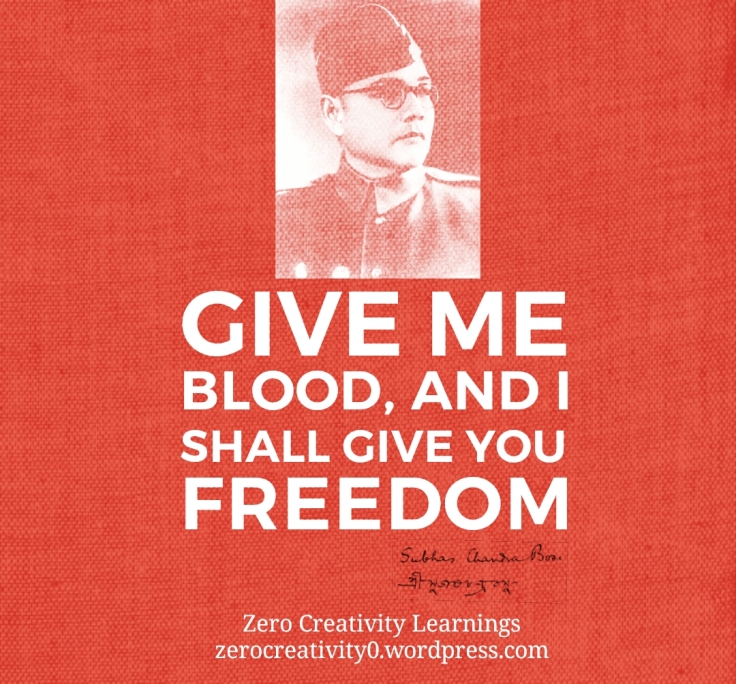
On the occasion of Netaji’s Birthday, Famous quotes by Subhas Chandra Bose.
National Integration Council logo was designed by iconic designer Benoy Sarkar. An alumni of National Institute of Design (NID), Ahmedabad, Mr. Sarkar who was blessed with teachings from legendary graphic designers like Paul Rand at Yale University while doing his masters. The National Integration Council originated in a conference convened by Prime Minister Jawaharlal Nehru in 1961. The purpose was to find ways to counter problems that were dividing the country including attachment to specific communities, castes, regions and languages. Now it is a body under Ministry of Home.
For more details find Biography and work of Mr. Benoy Sarkar.
The logo is iconic, depicting people joining hands to integrate and assimilate ideas. The efforts aims to propagate a secular, equal and strong socio-economic and political fraternity in India. These values are enhanced visually by the use of the national tri-colour palette of Indian flag.(Source: D’source, IIT Bombay)
Delhi Transport Corporation (DTC) logo was designed by Benoy Sarkar, alumni of National Institute of Design (NID), Ahmedabad. Mr. Sarkar who was blessed with teachings from legendary graphic designers like Paul Rand at Yale University while doing his masters. This logo is one of the master pieces from his work.
The logo presenting the inter-connecting arrows facing each other signify the inter-sate local bus services. The overlap and use of mirror images creates an interesting and unique form to show interconnected transport between states. The simple and open juxtaposition of arrows also connotes efficiency in terms of speed, quality service, continuous services etc (Source: D’source, IIT Bombay)
For more details find Biography and work of Mr. Benoy Sarkar.
The first marketing initiative of its kind, Incredible India was conceptualized in 2002. The team behind the campaign was V Sunil from O&M Delhi and Amitabh Kant from Ministry of Tourism. The whole campaign was aimed at branding to create a distinctive identity for the country. The exercise resulted in the iconic Incredible India logo. The Department of Tourism team was behind the conceptualization of the logo involving V.K. Duggal, Rathi Vinay Jha and Aitabh Kant.
In 2004, the Ministry of Tourism in India initiated the glorious “Incredible India” campaign with the main theme of “Atithi Devo Bhava”meaning ‘Guest is God’; with an aim to create a sensitivity towards tourists visiting India and the stakeholders facilitating the development of tourism in India. The exclamation mark forms the ‘I” of India. The exclamation used creatively across several visuals compliments the concept behind the word “Incredible” (Source: D’source, IIT Bombay)
Exclamation sign in Incredible India logo was used to great effect across all communications. The campaign successfully established India as a high-end tourist destination, generating a 16% increase in tourist traffic in the first year. (Source: incredibleindiacampaign.com). The campaign execution was mainly done in foreign markets in both print and digital media. Some of the work with creative use of Incredible Indian Logo can be viewed on their website.

India has a rich tradition of festivals and for festivals, Rangoli Designs will be an integral part of celebrations. You can find many posts on Rangoli Designs on my blog like World’s Largest Rangoli. Making Rangoli Designs is a part Indian Culture and is being followed since many years. Basically Rangoli Designs are created using colours sand, flower petals, rice, flour etc. They are drawn on the floors, courtyards, grounds. One of the types of Rangoli is called as Sankar Bharti Rangoli. It is a the most popular in Maharashtra. On many occasions like Ganesha Festival, Diwali we create Sanskar Bharti Rangoli Designs.
A very special technique is followed to draw Sanskar Bharti Rangoli Designs. It is drawn using either three or five fingers to create beautiful patterns and Curves. Sanskar Bharti Rangoli Design with five fingers is called as ‘Paach Boti’ meaning (Five Fingers).It has unique style to draw borders, circles, curves and patterns. You can search for many VDOs on Sanskar Bharti Designs for detailed procedures.
Bengaluru-based Graphic Design studio Ray and Kesavan designed the logo for Infosys in 1996. When Infosys was planning to scale up exponentially, they approached Ray and Keshavan to design Infosys logo. The organisation had to be lifted from an Indian brand to a global brand. The Infosys logo had to be designed for a brand Continue reading “Infosys Logo by Ray and Keshavan”
I am really happy to announce that ‘Classic Logos of India‘ published on Every Friday has got 25 posts in 25 Weeks! Readers can enjoy the posts Continue reading “Celebrating 25th Week of Classic Logos of India”
It was early 70s when Viru Hiremath from Vartul Communications designed the J K Tyre Logo. The name JK is derived from the initials of Kamlapatji and his father Seth Juggilal Founders of the Organisation. J K tyre is the market leader and No. 1 Tyre brand of India.
![]() Tanishq, pioneering the concept of branded jwellery became a prominent jewellery brand of India. Head quartered in Bangalore, is a division of Titan Company Limited, promoted by TATA Group. TATAs In collaboration with Tamil Nadu Industrial Development Corporation (TIDCO), it formed Tanishq. It is combination of TATA, Tamilnadu and Nishq. Nishq is a sanskrit word and it means necklace of gold coins.
Tanishq, pioneering the concept of branded jwellery became a prominent jewellery brand of India. Head quartered in Bangalore, is a division of Titan Company Limited, promoted by TATA Group. TATAs In collaboration with Tamil Nadu Industrial Development Corporation (TIDCO), it formed Tanishq. It is combination of TATA, Tamilnadu and Nishq. Nishq is a sanskrit word and it means necklace of gold coins.
Tanishq logo was designed by Michael Foley, head the Titan Design Studio at that time. He was also a student of National Institute of Design, Ahmadabad.

Yet another great work by Prof. R K Joshi. He was prolific in using Calligraphy in art and design. The logo designed for the Chimanlal Paper Company who set up a special department to try and promote handmade paper since thirty years. They are producing handmade papers for more than five decades. Read more for further details about the legendary graphic designer R K Joshi at Biography and Works of Prof. R. K. Joshi . Some of his work in Indian logos can be found at Classic Logos of India.
Reblogging
——–
After graduating from college almost two years ago (damn it, I feel so old), I made a personal vow to never stop learning. I enrolled myself in an Intro to Finance class in Coursera (from design to finance – go figure), and I made it through the end, except for one little thing: the Final Exam […]
via Self-studying Design and Other Things — Lost Civilizations
This week I tried to post something new and interesting about ‘How to Design Our Own Photo Quotes Easily’. In the last few posts, I have explained briefly about the free online easy tools with some examples of Photo Quotes. Today I would love to summerise the work of the whole week. If few photos on Nature Photography has touched you, please feel free to visit my photography portfolio Photolia.
I will recommend to try out all of these and choose the most easy to use.
The Earth Laughs in Flowers
The Earth has Music for those Who Listen
The Earth does not belong to Us, We belong to Earth
The Earth provides enough for every man’s need, but not every man’s greed
The Poetry of the Earth is Never Dead


If any body would like to share the work please reply in the comment. Thanks for making this week more beautiful like the quotes and photos.
Further to refer in this series,
Bengaluru-based Graphic Design studio Ray and Kesavan designed the logo for Kotak Mahindra Finance Limited. The task was to unify the offerings by Kotak from loans to investments under a single bank brand. The brand needed to be one integrated entity, externally and internally. It also needed a strategy that would help it compete effectively with well-established players and quickly transform its current perception of a ‘Mumbai-based brokerage’ to a national bank. They also wanted to make pride of the roots of the brand in ‘Indianess’
The letter form for ‘k’ in the Devanagari (‘क’) script was crafted to include the symbol for infinity in its form. The symbol of ‘Ka’, made it of distinctly Indian origin; while its curves form the universal ‘infinity’ sign, thus reflecting group’s uniquely global Indian personality. The Devanagari ‘Ka’ (‘क’) – has the knot of ‘ka’ (‘क’) around the strong red stem. This unit within the strong dark blue circle projects superiority, victory, strong foundation and stability. The group has thought on the basic tenets of economists that, man’s needs are unlimited. The infinite ‘Ka’ (‘क’) symbolises that we have the infinite number of ways to meet those needs.
![]()
KOTAK Logo Application (Source: Ray+Keshavan)
To read more about famous India Logos, visit Indian Brands
This week I got a chance of learning ‘How to Design Our Own Photo Quotes Easily’. In last few posts, I have explained briefly about the free online resource, some examples of Photo Quotes. Today I would love to add one more online tool for making photo quote. Adding some more examples this week’s Photo Challenge. Photographs are taken from my photography portfolio Photolia.
The photo chosen is converted into beautiful photo quote by using Canva and Font MemeFont Meme. These both tools are free to use online. I am thankful to Sonia and Prakash Hegade for mentioning about these tools for quote design.

Continue reading “How to Create Own Photo Quotes Using CANVA”
Adding some more examples in Earth, this week’s Photo Challenge. Photographs taken from my photography portfolio Photolia, are converted into beautiful photo quotes.The quote chosen is, ‘The Earth does not belong to Us, We belong to Earth’

Continue reading “How to Create Your Own Photo Quotes Easily”
Thanksgiving letters addressed to legendary designers for continuing source of inspiration for every designer including me. Have shared my learning inspired from their work. The medium used is Indian Post Card costing ₹ 0.5 only. The project has hand drawn illustrations digitised and printed at home on Post Cards. More read about the project: Project Post Card on Behance.
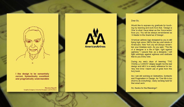
Continue reading “How to Make Designs Visually Powerful Learn From Massimo Vignelli”
Yet another work by Prof. R K Joshi while working with Ulka Advertising in 1983 and that was for CEAT tyres. Read more for further details about the legendary graphic designer R K Joshi Biography and Works of Prof. R. K. Joshi
Continue reading “How to raise the bars, Know from CEAT Logo”

May 5, is celebrated as World Cartoonists Day in the memory of publishing of the first ever colour cartoon, The Yellow Kid in 1895. On his 94th Birth anniversary posted about website showcasing R K Laxman’s cartoons and books. A great salute to an Indian cartoonist, Illustrator, and humorist, R K Laxman who created common man in 1951. Google had also paid tribute to R K Laxman a Google Doodle on R K Laxman. Interested can read more about the post on R K Laxman.
Thanksgiving letters addressed to legendary designers for continuing source of inspiration for every designer including me. Have shared my learning inspired from their work. The medium used is Indian Post Card costing ₹ 0.5 only. The project has hand drawn illustrations digitised and printed at home on Post Cards. More read about the project: Project Post Card on Behance.
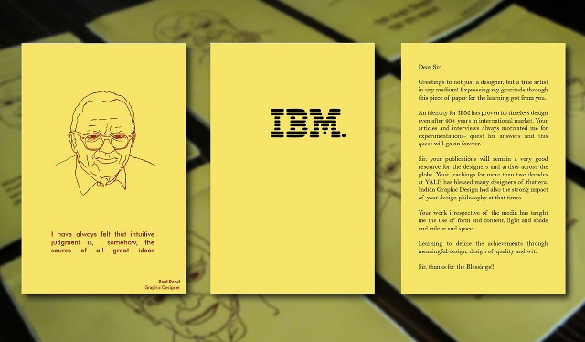
Continue reading “How to know the source of all great ideas: Paul Rand”
Thanksgiving letters addressed to legendary designers for continuing source of inspiration for every designer including me. Have shared my learning inspired from their work. The medium used is Indian Post Card costing ₹ 0.5 only. The project has hand drawn illustrations digitised and printed at home on Post Cards. More read about the project: Project Post Card on Behance.
Continue reading “Know How, Good is the Enemy of the Great!”
Thanksgiving letters addressed to legendary designers for continuing source of inspiration for every designer including me. Have shared my learning inspired from their work. The medium used is Indian Post Card costing ₹ 0.5 only. The project has hand drawn illustrations digitised and printed at home on Post Cards. More read about the project: Project Post Card on Behance.

Continue reading “How to end up in something Original: Sudarshan Dheer”
Thanksgiving letters addressed to legendary designers for continuing source of inspiration for every designer including me. Have shared my learning inspired from their work. The medium used is Indian Post Card costing ₹ 0.5 only. The project has hand drawn illustrations digitised and printed at home on Post Cards. More read about the project: Project Post Card on Behance.
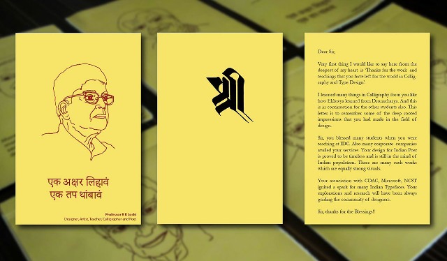
Continue reading “Need to Know Who was the best Indian Calligrapher”
Abstract Photography is not hard to job but getting good abstract is not an easy job! As the word abstract is, the definition of abstract photography is also not having the exact definition. But for the definition, it is a photography which does not represent the subject in a literal way. And is communicated primarily through shape, form, colour, pattern, texture and curves rather than image detail.
Already defining abstract photography, now we will see some ways to get wonderful abstract photos by simple techniques.
Continue reading “Need to Know How to Get Wonderful Abstract Photos”
In 1994, ICICI bank set up extending its start from 1955 as an initiative of World Bank, Indian Government and Indian Industry for creating a finance institution. Sudarshan Dheer, the Grand Master of Corporate Communication in India designed the identity for ICICI Bank Bombay Branch. Many of the very well established corporates have their identity designed by Sudarshan Dheer. We always experience the perfect bonding of art and design in his logos like HPCL, Titan, ESSAR. For more details on Sudarshan Dheer you can read Series on Design Masters in India at Design in India.
Continue reading “ICICI Bank Logo – What is ‘I’ you see in ICICI”


In continuation with the previous posts about,

Already defined abstract photography in the post on Abstract- Close Up. Now we will see some ways to get abstract photos.
As its conceptual and experimental photography, we can get the Abstract images by,
There will be much more techniques and tricks, one can explore while playing with a camera.
The magic of the 60s from Sudarshan Dheer, the Grand Master of Corporate Communication in India. Mr. Dheer at Graphic Communication Concepts designed the Essar logo for the group. For more details find Biography and work of Mr. Sudarshan Dheer.
Part-II: Connecting Kolam (Rangoli) and Spirituality by Beloo Mehra
——————————–
CONTINUED FROM PART 1 History of Kolam Creating paintings on a natural surface has a really ancient history in India, as evidenced by the Bhimbetka frescoes that are at least 15, 000 years o…
Source: Kolam:Computing and Cosmology within Indian Art (by Shivoham) – Part 2
Part-I: Connecting Kolam (Rangoli) and Spirituality by Beloo Mehra
————————————————-
An attempt, a drawing half-done is the world’s life; Its lines doubt their concealed significance, Its curves join not their high intended close. Yet some first image of greatness trem…
Source: Kolam: Computing and Cosmology within Indian Art (by Shivoham) – Part 1

In 1999, the TATA Group logo was designed by Wolff Olins London based famous brand consultancy. They also worked on Tata DoCoMo later in 2009 for the group. The meaning of the logo is as follows,
Tata Group logo monogram and the logotype together represent the new expanding face of Tata Group of Industries, a fountain of knowledge or may be a tree of utmost trust subsumed in the reversed out capital ‘T’ against a modern and energetic blue colour of the ellipse. From the service-quality point of view, the logo image has advanced further in the 21st century and The Tata marque has become a symbol of quality, reliability, and real value, not just in India but in other parts of the world too. (Source: D’source, IIT Bombay)
As per the design agency, the symbol was particularly designed to look good on cars, an important growth market of TATA Group.
Interesting fact about the Godrej logo is its typographic logo having signature of Mr. Ardeshir Godrej, Founder of Godrej. It is one of the unique logos in the world having signature as a logo. Godrej logo is in use since decades as a signature except some colour changes. The initial logo in blue colour was unbeaten for more than 100 years. The colour was changed to red later on.
Its year 2007, when Godrej appointed Inerbrand, UK based brand consultant for making this logo contemporary. In 2008, a three-colour pattern, maroon, green and blue, was used to fill the Godrej signature.
![]()
Recent Godrej Logo Designed by Interbrand
The objective behind the colours was to create a funky image in order to connect with youth of India. However, looking from design point of view, the calligraphic identity of Godrej reminds one of the trustworthy locks and cupboards of Godrej (the first product range of Godrej that helped establish the brand. (Source: D’source, IIT Bombay)
![]()
Indian Airlines
Another feather in the cap of Benoy Sarkar for designing logo of Indian Airlines. National Institute of Design has contributed to many of classical logos of India.The logo was designed around 1946 and was being in use till 2000. Logo has the typographic beauty with a simple sliding crossbar of the letter ‘A’. Above the windows of aircraft, “Indian Airlines” was written in English on starboard side and in Hindi on port side. The tail was bright orange, with its logo in white. In most of the aircrafts, the logo was also painted on the engines over its bare metal colour.
For more details find Biography and work of Mr. Benoy Sarkar.

After the name change to Indian, the company’s aircraft sported a new look inspired by the Sun Temple at Konark in Odisha. The tail of their aircraft had a partial blue wheel since practically 3/4 of the remainder is cut off. The wheel is over an orange background with the carrier’s name “Indian” written in English on one side of the fuselage, and in Hindi on the other. On 15 May 2007, the Government of India released the new merger livery, which was sent to Boeing in Seattle to repaint all the new fleet coming into the new Air India. (Source: Wikipedia)
T20 cricket is becoming more popular day by day due to thrillers involved in the format of the game. World Cup 2016 is being hosted by India. The excitement in the tournament is increasing as semi finals will be starting on 30th March 2016. With this as opportunity, would love to post the logo designs of the event and also all the former versions till 2007.
Two of the versions, 2014 and 2012 were designed by Australian company WiteKite. They have specialty for designing event and sports worldwide. Every logo is having standard format of presentation. Tournament name, Hosting country and Year is put at the bottom of the logo. Every logo has ball depicted from the number “0”.
Twenty20 World Cup 2016 Logo
Twenty20 World Cup 2014 Logo
The logo uses the colours of the Bangladesh flag with splashes of blue which represents Bangladesh’s iconic waterways (as well as being the ICC’s own colour). The T is made up of cricket stumps and the 0 in the T20 represents the cricket ball complete with Bangladeshi green seam while the white in the design lends an energetic, friendly and youthful feel to the logo. (Source: Yahoo News)
Twenty20 World Cup 2012 Logo
The event logo also called as Modern Spin. Designed by Australian creative firm Witekite, the logo incorporates and amalgamates the rounded look of the Sinhalese Script. The letter “T” forms a player which leads into the “2” while the “0” incorporates a cricket ball. The colours of the logo, with strong reds and oranges, are seen in both nature and Sri Lankan culture and arts, with their presence in the logo giving them a cricket “spin”. It has a natural sense of movement due to its fluid lines and forward angles. (Source:blackcaps.co.nz)
Twenty20 World Cup 2010 Logo
Twenty20 World Cup 2009 Logo
Twenty20 World Cup 2007 Logo
Reblog
Informative post from my fellow Blogger Celena on her blog Lost Civilizations
—————————————————-
(Note: I spent my entire commute home thinking of a title for this post and I’m super proud of what I came up with, okay. Except it turns out a lot of people have thought of this punny phrase…
Source: I Saw Design… Articles
One more examples of classical logos of India is Indian Post Logo. Indian Post is the largest postal network of the World. It was year 1993 when legendary designer R.K. Joshi was at teaching at IDC, IIT Bombay, he designed the logo of Indian Post. The logo was launched on India Post Day, October 9 that year. The philosophy behind the logo is explained here.
It represented speedy action and dynamism. The logo also shows the skill and good sense of aesthetics in form of an appealing asymmetric balance in the form. The form is an envelope, the straight parallel lines with sharp angular ends represent the speed with which the postal India services transfers posts across the length and breadth of India. The colour Red signifies the depth of its reach in India. Red adds extra prominence to the speed concept of postal services for which the logo stands for.(Source: D’source, IIT Bombay)
Later in year 2008, Ministry of Communications and IT, launched a new corporate identity of Indian Post working with a design agency, Oglivy and Mather. The new Indian Post Logo is inspired by the fact that Indian Post carries emotion across physical distance. At first glance, it is an envelope and at the next glance, it is a bird in flight, unhindered and unrestricted. The following bold strokes convey free flight. The new logo kept the red colour because of its longer association with Indian post. Press Information Bureau website has elaborated explanation about the design philosophy behind the new logo design.
The choices of colours are Red and Yellow. Red has been chosen for its traditional association with the Postal Service. It embodies passion, power and commitment. Yellow communicates hope, joy and happiness. Evidence of the combination of the two colours is found across the country.
It is the recognition of this stellar service in a changed world that has prompted the refurbishment of the India Post Logo. The first insight that was brought on board was the evolution of design, which has become increasingly organic. This is a departure from straight lines, which the current logo is dominated by. There is an element of modernity that the refurbishment aims at. At the same time, there is a conscious effort to maintain an element of continuity. The ‘wings’ are the anchoring element that have been retained. (Source: PIB Press release)
Read more: Biography and Works of Mr. R. K. Joshi
d posted earlier on Mastheads of leading Indian Newspapers, Australian Newspapers. For my network of lovely people from UK, for the visual treat, adding mastheads of top ranked newspapers in United Kingdom.
A nameplate of publication is a designed title as it appears on the front page or cover. The term name plate is mainly used in America. It is also called as Masthead in the United Kingdom and many other Commonwealth Nations. In lay man’s terms it is also called as logos of newspapers.
The Sun
Daily Mail
Metro
Evening Standard
Daily Mirror
Daily Telegraph
Daily Star
Daily Express
The Times
i (Newspaper)
National Institute of Design, Ahmedabad, has given many classic logos to the Nation. One of the designers from NID, S.M. Shah designed the logo of FTII. Mr. Shah is from the third batch of Communication Design, 1967. It is the premier institute of film and television institute bringing together the training in film and television. FTII located in Pune, is serving as a center of excellence across the world. The logo is being used for more than 4 decades.
The logo presents the simple letter form in Devnagari. The angular stroke to the turn and the vertical stem of the letter connotes the impression of a rolled film strip. The angular stroke is repeated on the top right end of the Shiro-Rekha to provide visual balance to the composed letter form (Source: D’source, IIT Bombay)
I love this type of logos due to elegance of strokes of Devnagari Calligraphy and bonding of Art and Design. For more details on Mr. S. M . Shah.

One Love from the Indian Tribal Art- Warli. This has been demonstrated by Adivasi since ages. Noe it is quite popular and emerged as one of the forms of art. Artists like Jivya Mashe (Written about him in separate post: Jivya Mashe-Indian Warli Art) really took this art form of Warli to the world and at next level through his many national and international exhibitions. We tried this on 6 feet x 18 feet white clothe for a backdrop during the first birthday of my daughter Venu. Dung is applied on the clothe and then by using white colours the composition is illustrated. Me and my brother enjoyed while making this! This interesting method of preparing Warli is explained on D’source, IIT Bombay Website.
Forgot to reblog on International Women’s Day


This popular board game was designed by Elizabeth Magie in 1904, originally called the Landlord’s Game. The purpose of this game was to expose the…
View original post 589 more words
On the eve of International Women’s Day from BALASUBRAMANIAM
—————————————————————-
Today is International Women’s Day. Women have a way of bringing new nuances to whatever they do. It’s the same in Design. Women designers have brought such richness to the profession i…
Source: Women in Design
You may be curious about who designed Aadhar Logo, the answer is here. Graduate of Applied Art faculty from Nagpur University Mr. Atul S Pande won the national logo competition held by Government of India in 2010 and India got Aadhar logo. Project UIDAI initiated to issue Unique Identification Number to every Indian Resident. Logo depicts the Sun and Fingerprint. It symbolically depicts a dawn of new identity of every individual, endowed with a unique number for each individual.
Philosophy of Aadhar Logo in his own words,
“Idea about using red and deep yellow is very direct and simple. Both are bright and vibrant colours, which deliver freshness and evoke enthusiasm. One should feel fresh and a bit excited while watching it. Significance of deep yellow is for gaining knowledge and red signifies community involvement.”
“I had to create something which is easily recognizable. Any rural person would be able to easily recognise the sun and the fingerprint.”
For more on Atul S. Pande, logo designer of Aadhar and his work in the field of Design you can visit his Behance profile.
Trade Fair Authority of India

In 1974, logo of Trade Fair Authority of India then was designed by Benoy Sarkar, alumni of National Institute of Design (NID), Ahmedabad. Trade Fair Authority of India is now named as India Trade Promotion Organisation (ITPO). Mr. Sarkar was blessed with teachings from legendary graphic designers like Paul Rand at Yale University while doing his masters.
The logo has an interesting depiction of letters T and F. The tone is a fusion of preservation of traditions of trade and investments along with modern identity of ITPO. The logo has a universal form. It signifies an authority of India exercising trade through fairs and exhibitions in India and abroad. (Source: D’source, IIT Bombay)
For more details find Biography and work of Mr. Benoy Sarkar.
Titan Company
In 1987, Titan logo was designed by Sudarshan Dheer, the Grand Master of Corporate Communication in India. Titan is a joint venture of Tata Group and Tamil Nadu Industrial Development Corporation.This logo is still “NOT OUT” for almost three decades. Mr. Dheer has contributed to the discipline of graphic design for over 50 years. Many of the very well established corporates have their identity designed by him.
The most attractive aspect of the logo is the play with letter ‘T’ creating a circular hallow around it. The form reminds of a watch dial and the internal parts of its machinery. Simple and elegant in form, the logo beautifully elucidates the traditional ethos and modern identity of Titan products. (Source: D’source, IIT Bombay)
For more details find Biography and work of Mr. Sudarshan Dheer.

Jivya Soma Mashe is the face of Indian tribal art called Warli. He took this form of art made during the rituals of adivasi to the higher level and spread all over the World. His exhibitions were held in France, Germany, Italy and USA. Jivya Soma Mashe has also joint exhibition with Richard Long- Famous English Sculptor and Land Artist. Jivya Soma Mashe, a legendary Warli artist received Padma Shree for his contribution to this form of art in 2011.
Tried to connect with this great artist with following online presence of his works,

Steel Authority of India Limited (SAIL)

Again a great impact on Indian Graphic Design by legendary designer R.K. Joshi. In 1973, while working with Ulka Advertising he designed the logo for SAIL. Steel Authority of India Limited is one of the largest state-owned steel making Indian company and one of the top steel makers in the world. The same logo is being in use for more than four decades.
The symbol using the triangular form with an upward direction indicates growth and development of steel industry. The solid rhombus used enclosed within the triangle seems to agree with the fact that SAIL stands to infuse high level technical and managerial expertise.(Source: D’source, IIT Bombay)
Read more: Biography and Works of Mr. R. K. Joshi
State Bank of India (SBI)
It was the year 1955 when SBI get established and first version of the logo came into existence. It has banyan tree in it and name written in Hindi and English with year of establishment at the bottom of the tree. ![]()
Second version of SBI logo is designed by Shekhar Kamat, alumni of NID almost 45 years ago. India’s largest commercial bank and also a fortune 500 company still using the same. There are many interpretations which can be drawn but the philosophy behind the design is here.
As an initial response to the circle form with an open hole, it looks like a key-hole. But, the real concept behind the design being that the circle encloses a common man inside at its centre. The common man represents the centre of the bank’s business. The circle signifies the service of trust, security and perfection for the common man. Moreover, the slogans ‘With you all the way’ and ‘The banker to every Indian’ support the idea of serving the common man as the epicenter of its activities. This logo is a unique example of how to create a quality of a concept with most basic geometric form of design i.e. the circle. (Source: D’source, IIT Bombay)
It is said that inspirations for this design came from the Kankariya Lake in Gujarat and logo too has very close resemblance with the top view of the lake as seen on google map.


Source: Chihuly Studio
Fiori di Como installed in 1998 at Bellagio Resort, Las Vegas. The great art work by Dale Chihuly, an American glass sculptor. His installations and art works are created by manual blown glass. Fiori Di Como is a ceiling sculpture of 2,000 hand-blown glass blossoms by Dale Chihuly that hangs in the Resort’s lobby! It covers about 2000 square feet of ceiling. We can imagine the volume of the work and number of people involved in making such a beautiful installation. Actual installation can experienced in a VDO on Fiori di Como on You tube.
Chihuly’s other artworks and installations can be found at his website and in a VDO there. We can visit the Chihuly Workshop, a place for experimentation, studio editions and publishing his artworks. Get some art and designs inspiration from Chihuly.

PS: This post is inspired by the Post from my new friend on her blog Instareads. Thanks to her for introducing me such great personality!

Welcome Group, ITC Hotels

Logo is designed by legendary calligrapher and type designer R.K. Joshi. He was a student of Sir J J Institute of Applied Art, designed the core Indian fonts used in Microsoft Windows. ITC is still using the same logo.
The design was a mark of extension of ITC to hotels in 70s. Surrounding the theme of ‘truly Indian’, ITC gave the name of ‘Welcome group’ to its chain of hotels. The letter W beautifully envisages the ethos of Namaste (the Indian traditional gesture of expressing ‘Welcome’). Conceptually, the form elucidates a universal form to accommodate India that unifies different cultures and religions as one whole. (Source: D’source, IIT Bombay)
This post is written to pay tribute to Prof. R. K Joshi who left the world on 5th February 2008.
Read more: Biography and Works of Mr. R. K. Joshi
PNB Logo is designed by legendary calligrapher and type designer R.K. Joshi in 1984. Yet another examples of logo designed by bonding art and design together. R. K. Joshi was a student of Sir J J Institute of Applied Art, designed the core Indian fonts used in Microsoft Windows. PNB Logo is still in use since 1984, more than three decades.
Design with letter captures the ethos of the letter in Gurmukhi to conceptually complement PNB. The orange colour also compliments the Indian ethos and traditional image. The Gurmukhi letterform enclosing a circle compliments the identity of PNB as a nationalized bank (system of the bank under the control of government). (Source: D’source, IIT Bombay)
Read more: Biography and Works of Mr. R. K. Joshi
Andy Murray who made history by winning Wimbledon on the 7th day of 7th month and 77 years after the last British, Fred Perry to win the trophy. These numbers and his initials constitute the logo designed by London based Aesop Agency. This identity mark used as Andy Murray logo, got mixed responses saying its resemblance to many of the existing logos.
It says the logo is modern mark that captures Andy’s energy and spirit whilst subtly referencing his affinity with the number ‘77’. It’s simple and striking, with heraldic cues that echo his dominance on the court. Source: The Guardian
Novak Djokovic and his team, together with PRpepper web agency, released an official video celebrating new djokovic logo and explaining its meaning. This video elaborates the design process of new djokovic logo and is available on YouTube. It explains the inspiration behind the logo is the Greek alphabet, medieval Serbian lettering and birds in flight.
Nadal’s Logo on his website doesn’t have his initials in it but it references his nickname ‘the raging bull’. It doesn’t have distinguished look like other logos of tennis greats.
Many heads we saw on the tennis court with two lettered monogram RF. This Roger Federer Logo is inspired by the logo of RF-Cosmetics, a fragrance by his wife Mirka Vavrinec and her father, introduced in 2003. RF-Cosmetics logo was a freehand squiggle depicting letters R and F. Federer wanted that a monogram would offer a connection as direct but not as literal as a team jersey. Federer liked the approach of the logo of cosmetics and suggested that Nike come up with a strategy along the same lines. This lead to Roger Federer Logo came into existence. Source: NY Times.
Need to be thought on what A BALASUBRAMANIAM has said. I strongly support the point he has made in this post!
Today’s list of Padma awards are out and there is no designer, still, in the list. I blogged about this, last year as well. The government finds it fit to recognise Ajay Devgn’s work as worthy of an award but not any of the design stalwarts, who used design to bring about long-lasting changes in society and the profession. To provoke a discussion on the subject, I present here, my list of Padma awards, deserving for design. This is of course, only the beginning. There may many more that I may have missed.
H Kumar Vyas, Design Educator, Ahmedabad  H Kumar Vyas deserves a Padma award for pioneering Design education in this country and giving a distinct Indian touch to the curriculum that was launched at NID, when the design programmes began. He continues to influence and contribute to design education, through his books and research.
M P Ranjan : Design…
View original post 426 more words
Operation Flood

Operation Flood Symbol for National Dairy Development Board (NDDB), was designed by Vikas Satwalekar, National Institute of Design (NID) in 1970-71.
The drop logo symbolizes the Operation Flood movement started by Verghese Kurien for NDDB. The White Revolution changed the face of dairy functioning in India, giving livelihood to thousands of milkmen in Anand. The timeless simplicity of the drop signifies the value of milk, its sustenance by and for people of India, making India the largest producer of milk in the world. (Source: D’source, IIT Bombay)
Read more about Operation Flood. For further details: Biography Prof. Vikas Satwalekar

The last day of this week’s challenge which gave me a wonderful opportunity to showcase some hand lettering art here. Posted few works using chalk on the wall, Rangoli Designs through out the week. The last entry for Alphabet which is the inspiring quote in Hindi Lettering. The lines say, “Work is Difficult hence worth Doing, Otherwise ordinary works are done by All”. For more projects on Hand Lettering visit the portfolio page. Also find some interesting photos in my entries to weekly photo challenges.
Akhil Bharatiya Marathi Sahitya Sammelan (All India Marathi Literary Conference) is a three day annual conference for literary discussions on Marathi Literature. All literature lovers participated in Marathi Sahitya Sammelan. Participants are Publishers, Printers, Journalists, Readers, Authors and Poets. This year is 89th version of this literary festival which is being hosted by Pimpri Chinchwad, city remembered for its industrial dominance.
The first Marathi Sahitya Sammelan was held in Pune in 1878 and its 89th version recently hosted by Pimpri Chinchwad. Last version of this event was hosted by a town in Punjab at Ghuman. The brief on historical journey of Marathi Sahitya Sammelan can be read on website of Marathi Sahitya Sammelan 2016.
In context with the objectives of this blog on art and design, I would love to present logos of the last few versions of Marathi Sahitya Sammelan. They are compiled here for visual treat of readers. ‘Bodh Chinha’ is the term coined in Marathi for Logo.


Hindustan Petroleum Corporation Limited (HPCL)

1974 version of the logo designed by Sudarshan Dheer, the grand master of Corporate Communication in India. This logo is still “NOT OUT” for four decade. Mr. Dheer has contributed to the discipline of graphic design for over 50 years. Many of the very well established corporates have their identity designed by him.
The logo for Hindustan Petroleum Corporation Limited (HPCL) celebrates the “Club HP” concept“Club HP” concept i.e. High-quality personalized “Vehicle and Consumer Care”. The slogan Future full of energy complements the design of curved lines joining together like a stream of energy fuel being poured into the vehicle. The visual forms connect with the concept instantly. Additionally, colours of Red used the bold initials HP with blue circle and lines provide clear combination, reasonable contrast between letters and shape giving the logo a marked elegance. The symmetry makes the form balanced and simple. (Source: D’source, IIT Bombay)
For more details find Biography and work of Mr. Sudarshan Dheer .
 Basics Strokes of Devnagari Calligraphy creating beautiful patterns called CalliPatterns. All the strokes are transformed in a round shape to indicate unity. Though not tried here, some other basic shapes like rectangle, square will also create beauty. Some more transformations can be viewed at CalliPatterns.
A nameplate of publication is a designed title as it appears on the front page or cover. The term nameplate is mainly used in America. It is also called as Masthead in the United Kingdom and many other Commonwealth nations. For the visual treat of the users just adding mastheads of some top ranked Australian Newspapers.
Herald Sun

The Daily Telegraph

The Courier-Mail

The Sydney Morning Herald
Housing Development Finance Corporation Limited (HDFC)

1977 version of logo, designed by Yeshwant Chaudhary, also a student of J J School of Art.
The geometric design of the logo in simple colours of black, white and red make it strong as a symbol. The letters H.D.F.C. also following the same geometric style, placed below the logo unifies the concept of housing loans. Security, preservation and trust are the words that come to mind while viewing the logo. It also encaptures the objective of HDFC as a professional service that aids support to people of India with integrity. (Source: D’source, IIT Bombay)
The logo is in use for almost 38 years. The Current version of the logo is depicted below. Read Biography and Work of Mr. Yeshwant Chaudhary.


When it comes to the power of Indian Defence and that of Indian Air Force, it is the fourth largest air force in the World. Indian Defence Education has broad base of education and training offered through its institutions. These training institutes and schools are spread all across the country. This post is to compile the logo or emblem of these defence institutes and schools.
Each emblem of these institutes has its unique tagline and National Emblem of India as a main element in the design of each logo. Most of these Indian Defence logos are designed in-house by the officers of Indian Defence. All of these emblems depict some basic elements of the nature referring to the features of the particular training school or institute. It has birds, mountains as design elements in the logo. These logos have all of Five Principles of Effective Logo Design, Simple, Memorable, Timeless, Versatile and Appropriate.
Typoday also called as Typography Day started as a part of the golden jubilee celebrations of the Indian Institute of Technology Bombay in 2008. First version of typoday was Jointly organised by Industrial Design Center (IDC) and India Design Association (InDeAs). Each version focuses on certain theme about typography, its users, education and applications.
This is the biggest event for typography learners, professionals to get together with renowned Typographers of India and across the World. For outreach of the typography, Poster design competition, Exhibitions, Seminars, Presentations are organised by host institute. Organizers also started logo design competition in 2014.
Themes of the typoday year wise are-
| Year | Theme |
| 2016 | Typography and Education |
| 2015 | Typography, Sensitivity and Fineness |
| 2014 | Typography and Culture |
| 2013 | Display Typography |
| 2012 | Typography in Publication Design |
| 2011 | Typography and Expression |
| 2010 | Typography and Identity |
| 2009 | Typography and New Media |
| 2008 | Indian Languages |
Here just compiled all the versions of typoday logos since 2008.


Doordarshan Logo was designed by Mr. Devashis Bhattacharya then a student of Visual Communication, National Institute of Design (NID). Mr. Bhattacharya made Doordarshan Logo as a part of classroom exercise to create logos. On September 15, 1959, logo celebrated the first launch of programme broadcasting in India. Since then the logo is being used and is not out for more than five decades.
The wall above features Doordarshan Logo. The wall has grid of tiles with symbols and logos that NID created during last few decades. It clearly depicts the work done by legendary designers of India for for many public and private organizations.
And Wish you a very Happy New Year 2016!

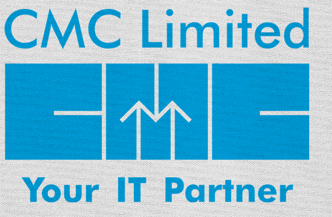
1975 version of CMC Logo was designed by Arun Kolatkar, trained as an artist from the J. J. School of Art. He was also a poet and had won many awards in literature including Sahitya Akadami award in 2005.
The logo depicts the concept of integrated systems engineering as a unit. The geometric shapes forming letters C, M and C express the image of information technology, integrated services and modern engineering in a simple and effective way. The upward arrows creating the visibility of letter ‘M’ compliments the word ‘maintenance’. The geometric square used to create joined letter forms makes the logo a balanced, harmonious unit concept. The form is minimalistic, but at the same time follows the principle of ‘less is more’.(Source: D’source, IIT Bombay)
Presently colour version of CMC Logo is in use. Your partner is the tagline added to the recent version.
Airport Authority of India
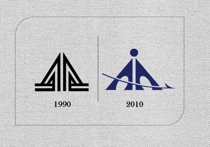
1990 version is designed by Benoy Sarkar, National Institute of Design (NID). He was blessed with teachings from legendary graphic designers like Paul Rand at Yale University while doing his masters. (Source: D’source, IIT Bombay)
New version of the logo is in-house design by their Department of Architecture. It has been used since April 2010. (Source: AAI Website)

The results of Typoday 2016 logo design competition are announced and winning entry is from Sukanta Paul, Pearl Academy, Delhi.

All other entries of runner up can be found at Typoday Website. It is the best fest for the typographers, beginners of typography and calligraphy. This year is ninth version of the event and it is being hosted by Srishti School of Art, Design and Technology, Bengaluru. You can block your dates, 25th to 27th February 2016. It is in collaboration with the Industrial Design Centre (IDC), Indian Institute of Technology Bombay (IIT Bombay) with support from India Design Association (InDeAs) and Aksharaya. You can visit the website for more information on Typoday.
You can browse here for some more resources on Logo Design.

In response to Today’s Theme ‘Teach Your (Bloggers) Well’
I would love to re-blog the old post on resource for logo design, any learner can have good idea by visiting the links embedded in the post. I hope it will teach well
![]()
Author compiles a list of quality resources that can help you to learn more about everything related to logo design. It addresses all the doubts related to
More than 400 links and resources on logo design.
 The Logo Design Guide is organized the into chapters compiling various aspects of logo design that make good logo or else turn into bad. It also lists some of the creative techniques to follow. Lastly it focuses on technical back ground required for post processes like printing.
Today is 94th Birth anniversary of R K Laxman full name, Rasipuram Krishnaswami Iyer Laxman oh!! Simply R K Laxman. An Indian cartoonist, illustrator, and humorist, R K Laxman who created common man in 1951. Google pays tribute to R K Laxman by today’s Google Doodle on RK Laxman.
His great work is compiled by his daughter in law Usha Laxman and granddaughter Rimanika Laxman. The website is online now, you can have a look at this online storyboard.
Great artist, who had Bal Thackeray as a fellow cartoonist, once said about his common man, “He’s been with me throughout my career. I did not find him. He found me… I would say he symbolises the mute millions of India, or perhaps the whole world, a silent spectator of marching time.”

You can like ‘Tribute to Legendary Cartoonist’ on Tumblr

 Was just curious about how many languages are there on Indian notes. Here is some information extracted from RBI website for ten rupees note.
There are fifteen Indian languages on almost all notes, excluding English and Hindi. This clearly indicates how India is rich in culture and heritage. These are only official languages but there are many more languages exist in India since last centuries. The language panel of Indian Currency also depicts the ‘Unity in Diversity’. Following table shows how a rupee is written in different languages and pronounced in Marathi. Added small drop of knowledge by sharing this information.
| Written | Pronunciation | Languages |
| টকা | टोका | आसामीज |
| টাকা | टका | बंगाली |
| રૂપિયો | गुजराती | रूपियो |
| روپے | रोपिह | काश्मिरी |
| रुपया | रुपया | कोंकणी |
| രൂപ | रूपा | मलयालम |
| रुपया | रुपया | मराठी |
| रुपैयाँ | रुपैयाँ | नेपाली |
| ଟଙ୍କା | टंका | ओरिया |
| ਰੁਪਈਆ | रुपिया | पंजाबी |
| रूप्यकम् | रूप्यकम् | संस्कृत |
| ரூபாய் | रुपाई | तमिळ |
| రూపాయి | रुपाई | तेलुगु |
| روپے | रुपय | उर्दू |
A zine (an abbreviation of fanzine, or magazine) is the most commonly a small circulation self-published work of original or appropriated texts and images usually reproduced via photocopier. Seen some exciting zines!
DIY Guides and Other Zines are available for Download.
A Barnard Zine Collection compiles various genres of Zines.
![]()
Author compiles a list of quality resources that can help you to learn more about everything related to logo design. It addresses all the doubts related to
More than 400 links and resources on logo design.
 The Logo Design Guide is organized the into chapters compiling various aspects of logo design that make good logo or else turn into bad. It also lists some of the creative techniques to follow. Lastly it focuses on technical back ground required for post processes like printing.
Last night seen the Ebru VDO on YouTube which lead to inspiration for compilation of information on different forms of Art with different combinations of colors and substrates. I know that there may be many webpages compiling the information, but I want to visit different sources of information and compile then briefly. Through this it will be comprehensive information and good collection of the different forms. This will be continuous activity to post here on different forms of ART.
The readers are requested to suggest, comment and provide additional info.
Will start with Ebru as it ignited the mind.
Ebru also called as paper marbling.
Digital Collection of Marbled Paper mainly from Europe, at University of Washington. Some of the collections on fantasy marbled papers in digital collection in the library.

Free book on Paper Marbling all the tips and tricks of years marbling paper, Download.
Classification of Ebru in Turkey

Suminagashi is Japanese art making from marbled papers.
You can browse some Resources and DIY online.


A great resourse for the students, professionals in the area of gaphic design. Dr. Paula Dimarco has created this resource using the teaching materials, classwork, students projects and relavant links to the others work. Many pdfs, VDOs, hand on sessions answer all the queries related to the subject. She teaches many courses at CSUN (California State University, Northridge), they are Computer Graphics, History of Graphic Arts, Production Design. The guidlines mentioned for the project work are very useful and clear the fundamentals of the design process. I really cleared my fundamental concept of LOGO Design using the resource she shared. There are tutorials, tips, practice sessions on Photoshop Illustrator also. We can take scheduled course at this webpage. Learn Poster Design, Logo Design, Branding and many things at a single point. I am sure that this is one of the best design resource for gaphic arts on internet.
I would like to thank Dr. D. for inspiring me to learn and practice more deeply, understanding many aspects of Logo Design.

Browsed some of the blogs which discuss the design education in detail.
Prof M. P Ranjan has Design for India blog and offers many books, Papers, Interactive Media to download at this blog. Thank you Professor, for sharing such valuble information and design thinking. He also shares the information categorically on Independent academia. You can also have thoughts by different contributors mainly on Design Concepts and Concerns. It takes quality time to read these blogs and think over them and to implement in the field while actually working on Design Problems.


